

Centro de Psicología Elemental
UI Redesign
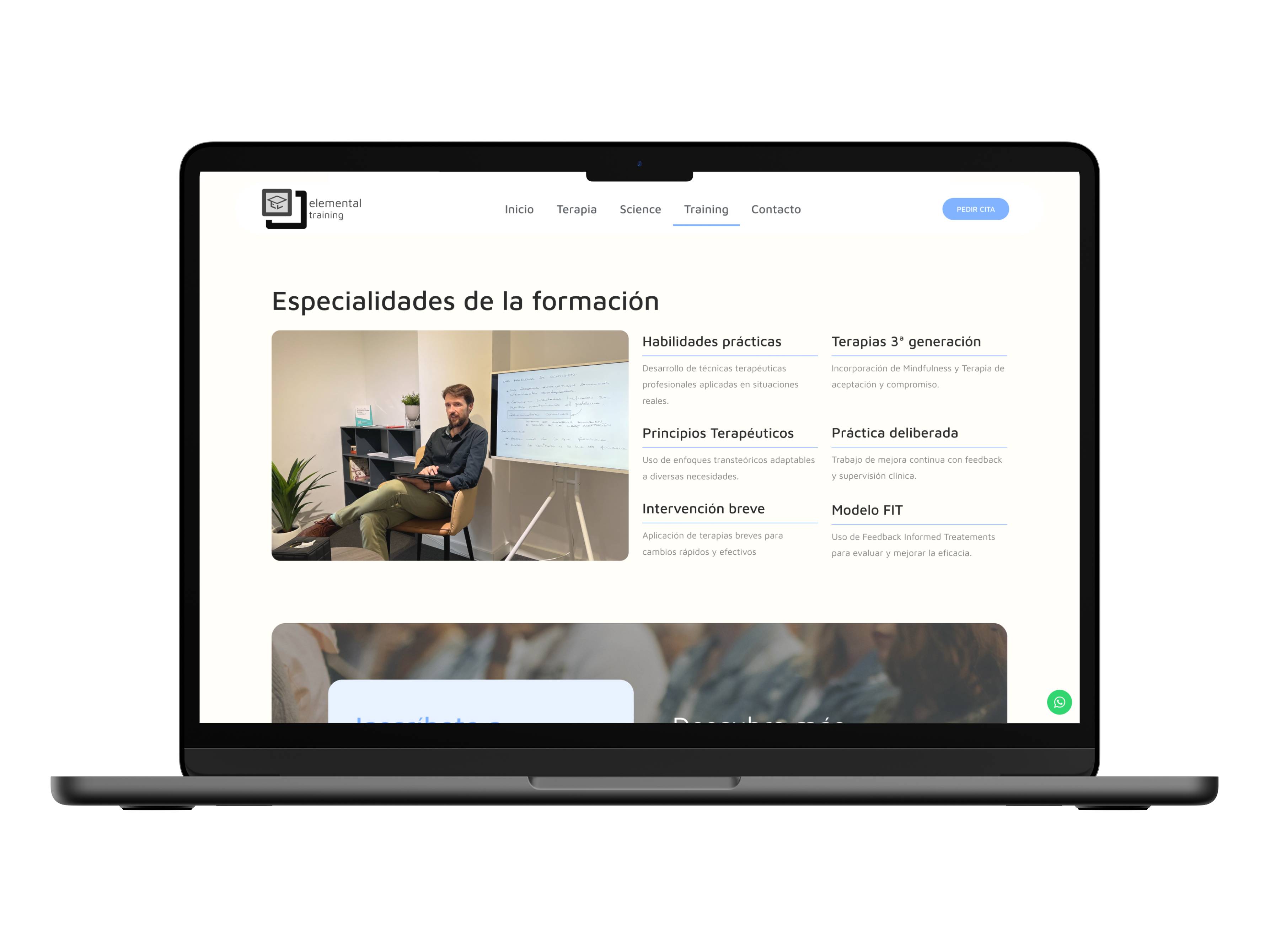
Go to site
See other projects
Project overview
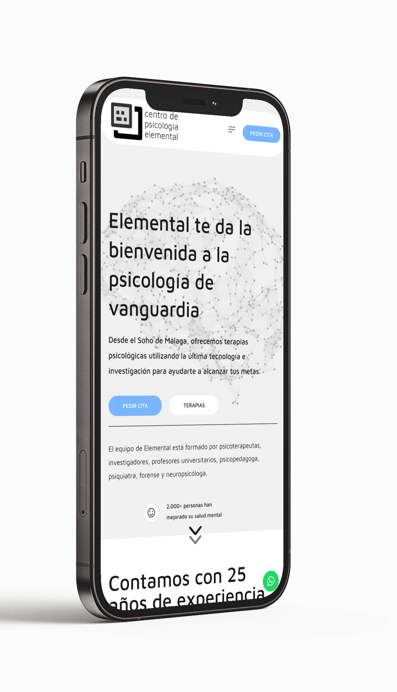
The goal was to modernize the center’s digital presence by aligning it with its brand identity and enhancing the user experience. As the UI designer, I created the initial layouts in Figma and handled the final implementation using WordPress and Elementor.
The "what"
The redesign was driven by the need to update the center’s digital presence to reflect its growth and professionalism. The goal was to enhance the user experience by making information more accessible and improving site interaction. Additionally, the project aimed to boost the site’s technical performance, ensuring fast loading times and a search engine–optimized structure.
The "why"
The redesign was driven by the need to update the center’s digital presence to reflect its growth and professionalism. The goal was to enhance the user experience by making information more accessible and improving site interaction. Additionally, the project aimed to boost the site’s technical performance, ensuring fast loading times and a search engine–optimized structure.
The "how"
I adopted the Design Thinking methodology, focusing on understanding and addressing user needs. Although no formal study was conducted, I put myself in the shoes of a new visitor to identify potential friction points and opportunities for improvement.
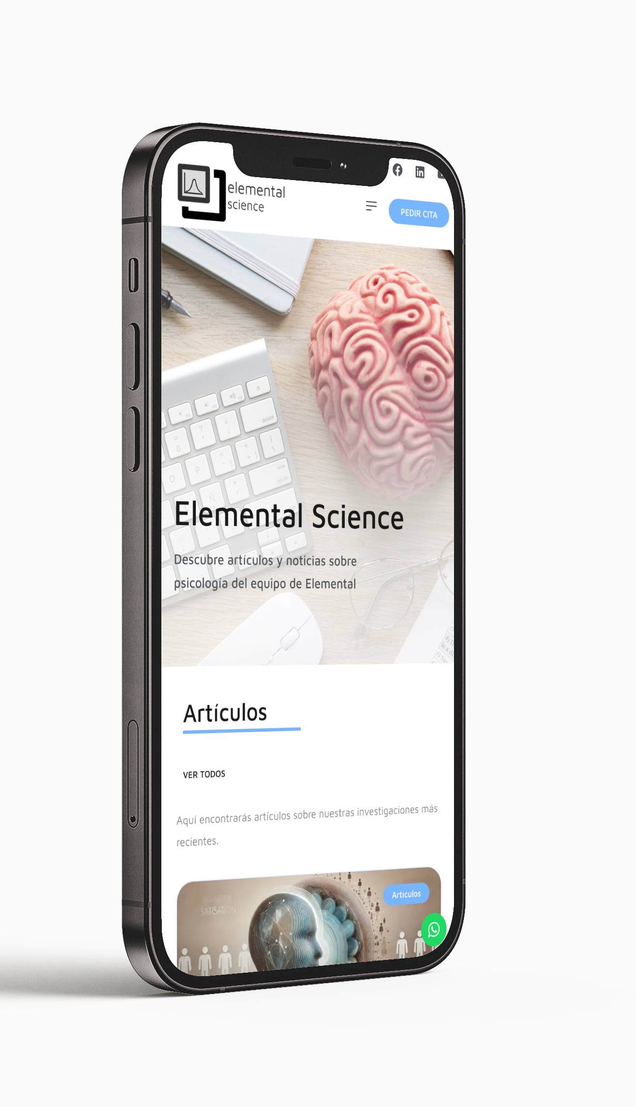
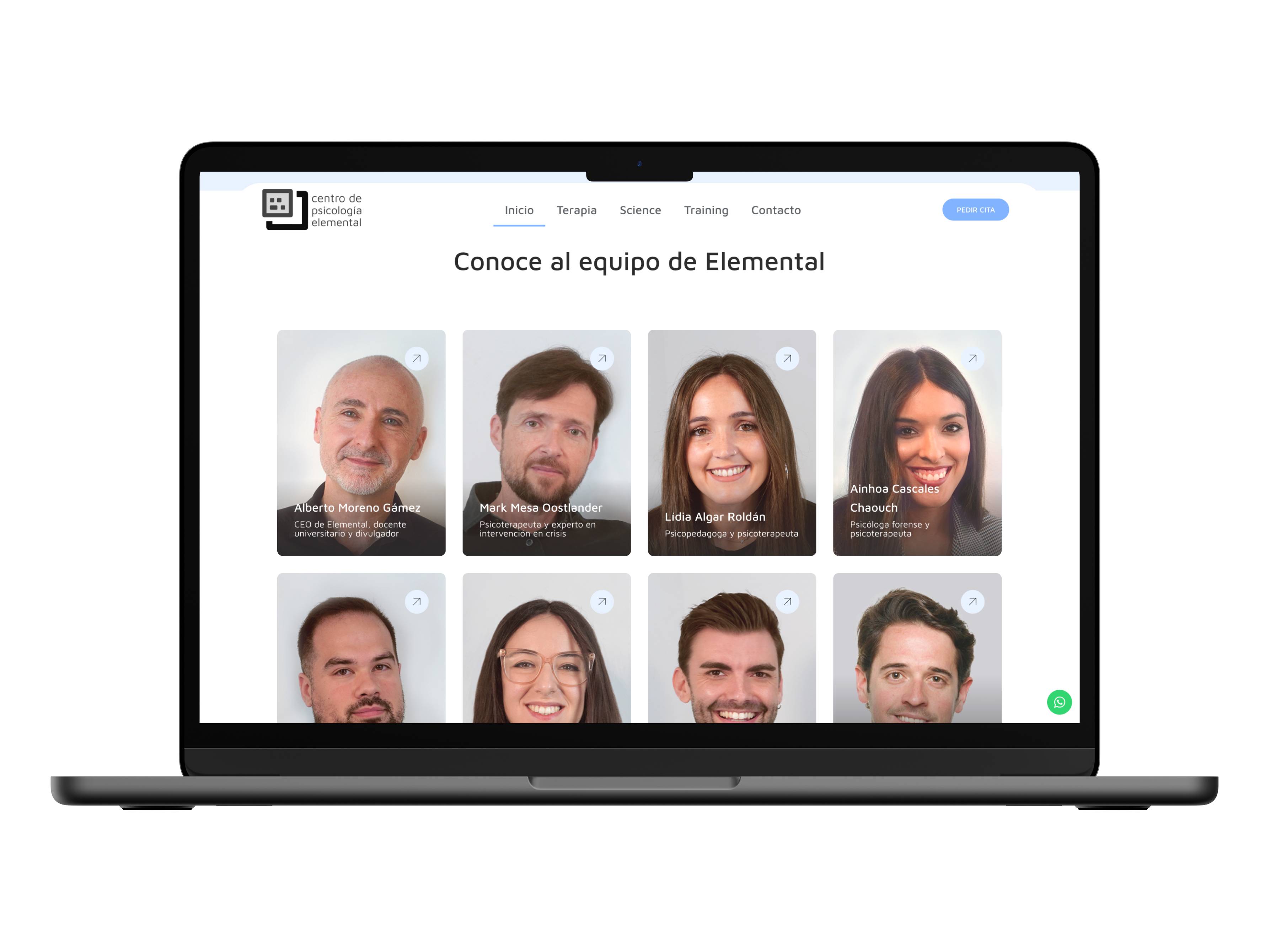
I redesigned the information architecture and navigation to enhance usability and site flow, anticipating the addition of new content. The structure was simplified by reducing the number of pages and organizing information in a clear, logical way.
Designs were validated through continuous feedback from supervisors and the client, as well as critical self-evaluations. This iterative process allowed me to refine and perfect the design before the final implementation.
Conclusions
The redesign resulted in a significant improvement in user experience, particularly in terms of flow, accessibility, usability, and web performance. The client’s feedback was very positive, expressing satisfaction with the final outcome.
One of the main challenges was balancing the modernization of the site’s visual appearance while respecting the existing brand identity. Additionally, efforts were made to enhance existing content while seamlessly integrating new elements.
This project taught me that UI redesign goes beyond aesthetics; it involves improving accessibility, usability, flow, and site navigation. I learned the importance of simplifying visual elements and prioritizing information hierarchy to avoid overdesign and content overload. I also understood the value of involving users through usability testing and continuous feedback, which helped identify friction points and adjust the design accordingly.